Northline Capital Partners - Client Case Study (Concept Project)
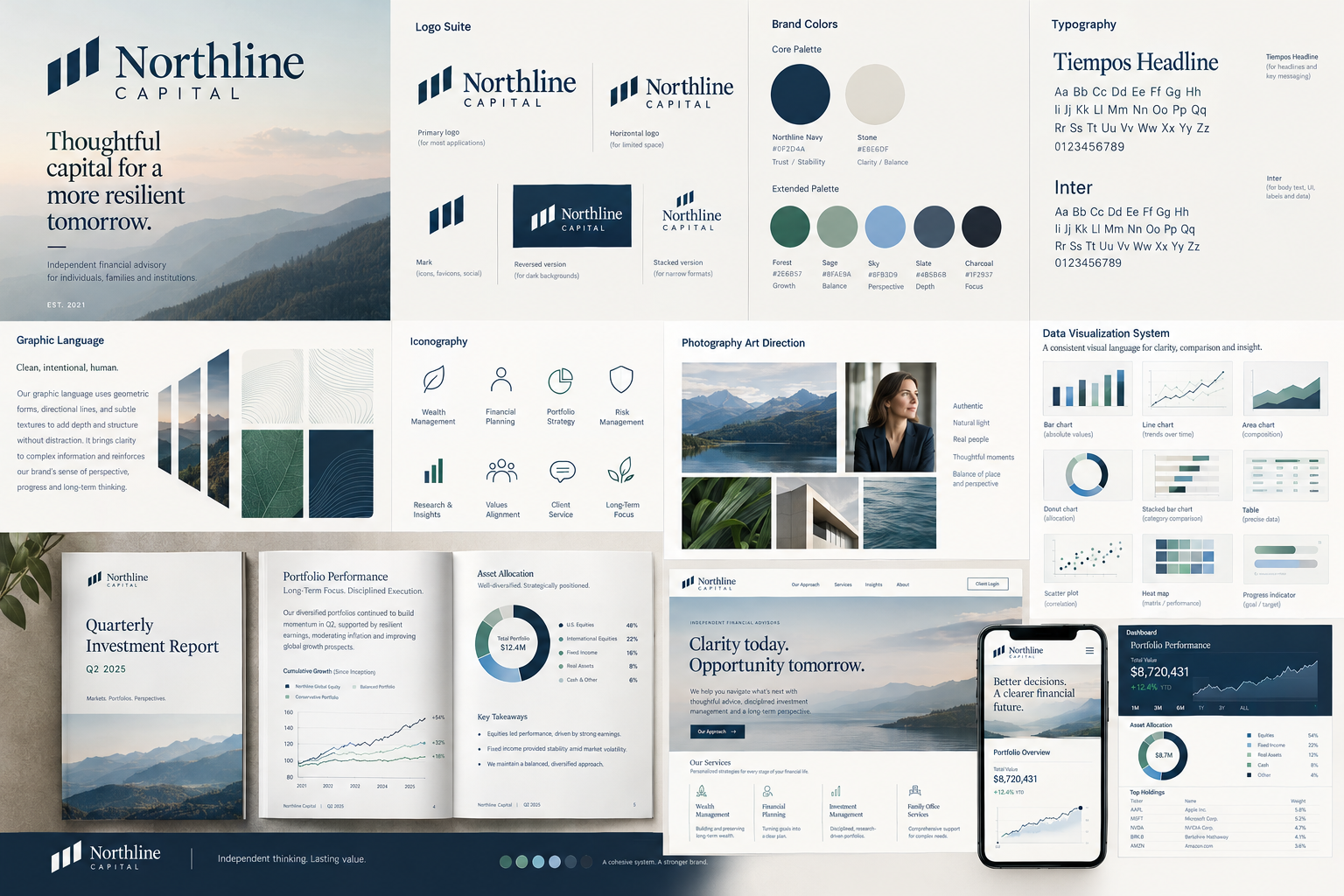
Brand Identity Evolution & Visual System
The client Northline Capital Partners is a fictitious independent financial advisory firm founded in 2005. The company works with high-earning professionals, business owners, and multigenerational families to help them make informed financial decisions and build long-term wealth.
Over the past twenty years, Northline has grown from a small advisory practice into an established firm with a broader client base, a growing team, and an expanding range of services.
Its reputation is built on thoughtful advice, transparency, and a disciplined, long-term approach to financial planning. However, its visual identity has remained largely unchanged since launch.
THE CHALLENGE
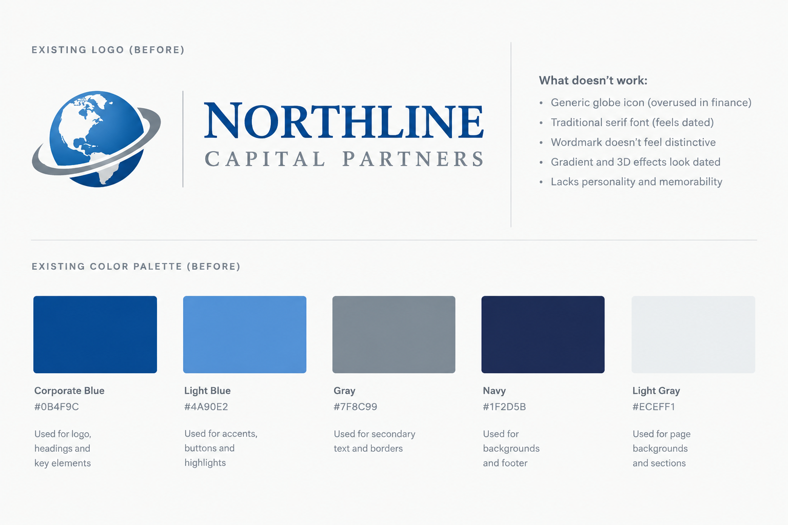
Northline's existing brand consists of a primary logo, a secondary logo, two brand colors, and two typefaces. While these elements once served the business well, they have become increasingly restrictive as the company has grown.
The logo lacks flexibility across digital platforms, presentation covers, small-format applications, and social media. Its visual style feels dated compared with the firm's current positioning, while the limited color palette makes it difficult to create clear, accessible, and visually engaging financial charts and data visualizations.
The brand also lacks a cohesive visual language beyond its core identity. There are no established photography guidelines, iconography, illustration styles, data visualization standards, or supporting graphic elements. As a result, presentations, reports, marketing materials, and digital communications often feel disconnected. The team has the basic building blocks of a brand, but not a complete system.
THE OPPORTUNITY
Northline does not need to reinvent its business. It needs a more mature and adaptable visual identity that reflects the quality of its work today and supports its next stage of growth.
The objective is to evolve the existing brand into a cohesive, contemporary system that balances financial credibility with clarity, warmth, and confidence. The new identity should feel established without being traditional, premium without being exclusive, and sophisticated without becoming unnecessarily complex.
TARGET AUDIENCE
- Business owners and senior professionals seeking long-term financial guidance.
- High-net-worth individuals and families navigating complex financial decisions.
- Existing clients who value continuity, trust, and a personal relationship with their advisor.
- Prospective clients who expect a polished, credible, and digitally fluent financial services experience.
BRAND ATTRIBUTES
Clear. Considered. Grounded. Assured. Forward-looking.
The brand should communicate expertise without intimidation, sophistication without extravagance, and optimism without the visual clichés often associated with financial services.
Project objectives
Refine the existing logo into a flexible identity with responsive configurations for different sizes and environments.
Develop a more versatile color system that supports brand recognition, hierarchy, accessibility, and complex financial data.
Establish a typography system that works across editorial content, presentations, reports, dashboards, and digital interfaces.
Create a distinctive supporting visual language through graphic devices, iconography, image direction, and layout principles.
Develop data visualization guidelines for charts, graphs, tables, and financial reporting.
Build a practical brand system that can be consistently applied by an internal marketing team across multiple channels.
Deliverables
Logo refinement and responsive logo suite.
Primary and secondary color palettes, including data visualization colors.
Typography hierarchy and usage guidelines.
Supporting graphic elements and layout principles.
Iconography and photography art direction.
Data visualization system, including chart and graph examples.
Brand guidelines.
Sample applications across digital, editorial, and presentation formats.
The measure of success
The finished identity should feel like a natural evolution of an established business rather than a complete departure from its history. It should provide greater creative flexibility, improve the clarity of information, and establish a recognizable visual presence across every client touchpoint.